HTML, CSS & JavaScript
Chocolate Day 🍫
Sweet Chocolate Day page with chocolate rain, unwrap letter & love note.
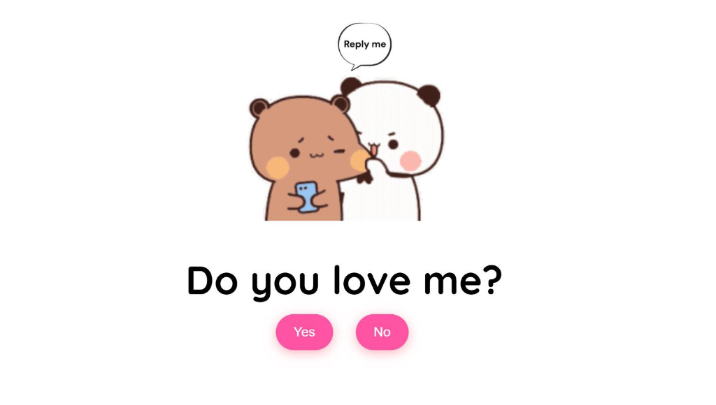
Create a playful and interactive Valentine's Day card that asks "Do you love me?" with a clever twist - the "No" button moves away when you try to click it, and clicking "Yes" reveals a beautiful heart animation! Perfect for expressing your feelings in a fun and memorable way!
This Valentine's Day project creates an interactive card that asks the special question: "Do you love me?" The page features animated video backgrounds, two interactive buttons (Yes and No), and clever JavaScript that makes the "No" button move to random positions when you hover over it!
The design uses a clean white background with pink gradient buttons, the Quicksand font for a modern feel, and a beautiful animated heart loader. When "Yes" is clicked, a stunning heart animation plays before revealing a sweet message with a romantic video!
Scroll down to the bottom of this page to get the complete project from our GitHub repository with all source code and assets!
⬇️ GitHub link available after Project Assets section
Below is the complete HTML structure for the "Do You Love Me?" Valentine's card.
Copy this entire code into your index.html file. It includes the question container,
result container, and animated heart loader.
<!DOCTYPE html>
<html lang="en">
  <head>
    <meta charset="UTF-8" />
    <meta name="viewport" content="width=device-width, initial-scale=1.0" />
    <link rel="preconnect" href="https://fonts.googleapis.com" />
    <link rel="preconnect" href="https://fonts.gstatic.com" crossorigin />
    <link
      href="https://fonts.googleapis.com/css2?family=Quicksand:wght@300..700&display=swap"
      rel="stylesheet" />
    <link rel="stylesheet" href="style.css" />
    <title>Do you love me?</title>
  </head>
  <body>

    <div class="question-container container">
      <video class="local-gif" src="Reply me love.mp4" autoplay muted loop></video>
      <h2 class="question">Do you love me?</h2>
      <div class="button-container">
        <button class="yes-btn btn js-yes-btn">Yes</button>
        <button class="no-btn btn js-no-btn">No</button>
      </div>
    </div>

    <div class="result-container container">
      <video class="gif-result" src="Love me.mp4" autoplay loop></video>
      <h2>I knew it😍!</h2>
    </div>

    <div class="cssload-main">
      <div class="cssload-heart">
        <span class="cssload-heartL"></span>
        <span class="cssload-heartR"></span>
        <span class="cssload-square"></span>
      </div>
      <div class="cssload-shadow"></div>
    </div>

    <script src="script.js"></script>
  </body>
</html>
Below is the complete CSS styling for the Valentine's card.
Copy this entire code into your style.css file. It includes button styles,
animations, and the beautiful heart loader with keyframe animations.
* {
  padding: 0;
  margin: 0;
  box-sizing: border-box;
}

body {
  display: grid;
  justify-content: center;
  align-items: center;
  background-color: white;
  font-family: "Quicksand", sans-serif;
}

.container {
  position: absolute;
  top: 50%;
  left: 50%;
  transform: translate(-50%, -50%);
  transition: 0.2s;
}

.question-container {
  position: absolute;
  top: 40%;
  left: 50%;
  transition: 0.2s;
}

.local-gif {
  width: 100%;
  max-width: 300px;
  border-radius: 10px;
  display: block;
  margin: 0 auto 3rem auto;
  pointer-events: none;
}

.question {
  font-size: 3.5rem;
  margin-bottom: 1rem;
}

.button-container {
  display: flex;
  justify-content: center;
  gap: 1.5rem;
}

.btn {
  position: absolute;
  border: none;
  border-radius: 50px;
  padding: 14px 24px;
  font-family: "Poppins", sans-serif;
  font-size: 18px;
  cursor: pointer;
  transition: all 0.3s ease;
  background-color: #ff54a4;
  color: white;
  transform: scale(1.05);
  box-shadow: 0px 4px 15px rgba(255, 107, 129, 0.5);
}

.btn:hover {
  background-color: #ffa4b1;
  transform: scale(1.1);
  box-shadow: 0px 6px 20px rgba(255, 107, 129, 0.7);
  text-shadow: 1px 1px 5px rgba(255, 182, 193, 0.8);
}

.yes-btn {
  right: 54%;
}

.no-btn {
  left: 54%;
}

.result-container {
  display: none;
  position: absolute;
  top: 40%;
  left: 50%;
  transform: translate(-50%, -50%);
  transition: 0.2s;
}

.gif-result {
  border-radius: 10px;
  margin-bottom: 2rem;
}

.result-container h2 {
  font-size: 3.2rem;
  text-align: center;
}

/* Heart loader */
.cssload-main {
  display: none;
  position: absolute;
  content: "";
  top: 17%;
  left: 50%;
  margin: 200px auto 0 auto;
  transform: translate(-100%, -240%);
}

.cssload-main * {
  font-size: 62px;
}

.cssload-heart {
  animation: cssload-heart 2.88s cubic-bezier(0.75, 0, 0.5, 1) infinite normal;
  top: 50%;
  content: "";
  left: 50%;
  position: absolute;
}

.cssload-heartL {
  width: 1em;
  height: 1em;
  border: 1px solid #ff0000;
  background-color: #ff0000;
  content: "";
  position: absolute;
  display: block;
  border-radius: 100%;
  animation: cssload-heartL 2.88s cubic-bezier(0.75, 0, 0.5, 1) infinite normal;
  transform: translate(-28px, -27px);
}

.cssload-heartR {
  width: 1em;
  height: 1em;
  border: 1px solid #ff0000;
  background-color: #ff0000;
  content: "";
  position: absolute;
  display: block;
  border-radius: 100%;
  transform: translate(28px, -27px);
  animation: cssload-heartR 2.88s cubic-bezier(0.75, 0, 0.5, 1) infinite normal;
}

.cssload-square {
  width: 1em;
  height: 1em;
  border: 1px solid #ff0000;
  background-color: #ff0000;
  position: relative;
  display: block;
  content: "";
  transform: scale(1) rotate(-45deg);
  animation: cssload-square 2.88s cubic-bezier(0.75, 0, 0.5, 1) infinite normal;
}

.cssload-shadow {
  top: 97px;
  left: 50%;
  content: "";
  position: relative;
  display: block;
  bottom: -0.5em;
  width: 1em;
  height: 0.24em;
  background-color: rgb(215, 215, 215);
  border: 1px solid rgb(215, 215, 215);
  border-radius: 50%;
  animation: cssload-shadow 2.88s cubic-bezier(0.75, 0, 0.5, 1) infinite normal;
}

@keyframes cssload-square {
  50% {
    border-radius: 100%;
    transform: scale(0.5) rotate(-45deg);
  }
  100% {
    transform: scale(1) rotate(-45deg);
  }
}

@keyframes cssload-heart {
  50% {
    transform: rotate(360deg);
  }
  100% {
    transform: rotate(720deg);
  }
}

@keyframes cssload-heartL {
  60% {
    transform: scale(0.4);
  }
}

@keyframes cssload-heartR {
  40% {
    transform: scale(0.4);
  }
}

@keyframes cssload-shadow {
  50% {
    transform: scale(0.5);
    border-color: rgb(228, 228, 228);
  }
}
Below is the complete JavaScript code for the interactive functionality.
Copy this entire code into your script.js file. It handles the moving "No" button,
"Yes" button click event, and the heart loader animation.
const questionContainer = document.querySelector(".question-container");
const resultContainer = document.querySelector(".result-container");
const gifResult = document.querySelector(".gif-result");
const heartLoader = document.querySelector(".cssload-main");
const yesBtn = document.querySelector(".js-yes-btn");
const noBtn = document.querySelector(".js-no-btn");

// Change the position of no button
noBtn.addEventListener("mouseover", () => {
  const newX = Math.floor(Math.random() * questionContainer.offsetWidth);
  const newY = Math.floor(Math.random() * questionContainer.offsetWidth);

  noBtn.style.left = `${newX}px`;
  noBtn.style.top = `${newY}px`;
});

// Yes button functionality
yesBtn.addEventListener("click", () => {
  questionContainer.style.display = "none";
  heartLoader.style.display = "inherit";

  const timeoutId = setTimeout(() => {
    heartLoader.style.display = "none";
    resultContainer.style.display = "inherit";
    gifResult.play();
  }, 3000);
});
When the user clicks "Yes", a beautiful animated heart loader appears for 3 seconds, then transitions to show a romantic video with the message "I knew it😍!" - all on the same page without redirecting.
The result container is initially hidden with display: none and becomes visible after
the
heart animation completes. The video automatically plays when revealed.
This project includes video files for the animated backgrounds. Here's where to place them:
pages/
├── assets/
│   └── love-me-valentine/
│       ├── Reply me love.mp4  ← Question page video
│       ├── Love me.mp4        ← Result page video
│       ├── preview.png        ← Preview screenshot
│       └── (other assets)
│
└── downloads/
    └── love-me-valentine.zip  ← Complete project ZIP
To add your video files:
pages/assets/love-me-valentine/<video src="Reply me love.mp4" autoplay muted loop></video>
preview.pngpages/downloads/Visit our GitHub repository to download all files including HTML, CSS, JavaScript, and video files. You can download the ZIP file directly from GitHub.
Download ZIP FileMake this Valentine's card your own:
Modern browsers block autoplay with sound until the user clicks. The video starts on the first interaction.
Yes — replace the .mp4 / .gif files in the project folder with your own and keep the same filenames.
About 1-2 seconds on Wi-Fi, longer on slow mobile networks because of the GIFs.